How to Read Crypto Market Charts: A Beginner’s Guide

Why Crypto Market Charts Matter for New Investors
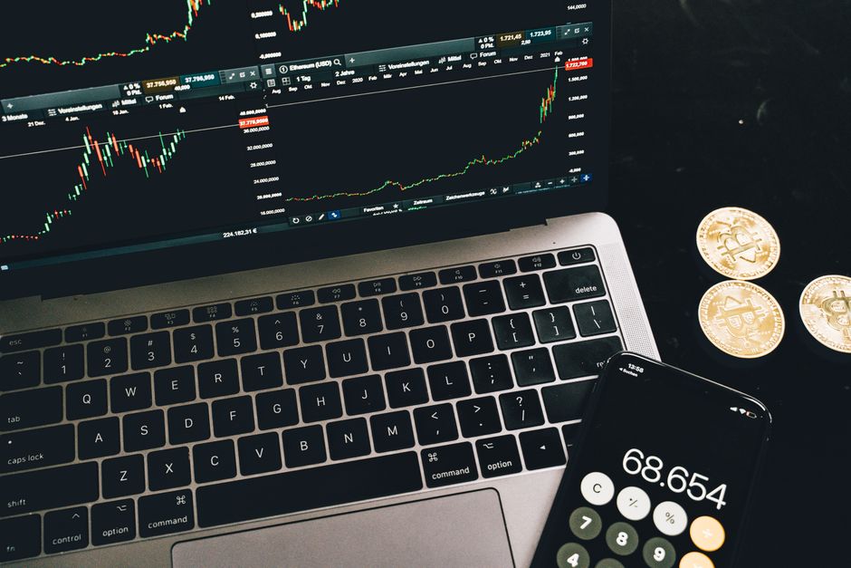
If you are just stepping into the world of digital assets, learning how to read crypto market charts is one of the most important skills you can develop. Unlike traditional stock markets with fixed trading hours, the cryptocurrency market operates around the clock, every day of the year. This nonstop activity generates a constant flow of price data that gets organized into visual charts. Those charts are the primary language traders and analysts use to assess market conditions, spot trends, and make more informed decisions.
Crypto market charts translate raw price movements into readable shapes and patterns. Without a basic ability to interpret those visuals, you are essentially navigating a complex financial market blindfolded. Understanding chart basics helps you move from guessing to analyzing, even if you have no prior experience with trading platforms. Many beginners rush to buy their first tokens without studying price history, only to get caught off guard by sudden swings. Taking time to learn chart fundamentals builds a stronger foundation for every future decision you make in this space.

Before diving into specific chart types, it is worth noting that **crypto markets are highly volatile and carry significant financial risk**. Nothing in this guide constitutes financial advice. Always do your own research and never invest more than you can afford to lose.
- Charts are the primary tool for analyzing cryptocurrency price movements
- Understanding visuals helps reduce emotional, impulse-driven decisions
- All chart types require practice before they become intuitive
Types of Crypto Market Charts You Will Encounter
The three most common chart formats you will see on any major exchange or charting platform are **line charts**, **bar charts**, and **candlestick charts**. Each format presents the same underlying price data differently, and each serves a distinct purpose depending on what you are trying to analyze.
A line chart is the simplest of the three. It plots a single point — typically the closing price — for each time interval and connects those points with a continuous line. This format makes it easy to spot the general direction of an asset over time, but it omits a great deal of detail about what happened during each individual period.
Bar charts, also called **OHLC charts** (Open, High, Low, Close), add more information by showing the full price range for each interval. Each bar displays four data points: the price at the open, the highest price reached, the lowest price reached, and the price at the close. This extra detail gives traders a clearer picture of intraperiod volatility.
Candlestick charts go a step further by encoding the same OHLC data into visually intuitive shapes. Each candlestick uses a body and wicks to communicate not just the price range but also whether buyers or s rs dominated during that interval. Candlestick charts are the most widely used format among active crypto traders because they reveal market sentiment at a glance.
| Chart Type | Data Shown | Best For |
|---|---|---|
| Line Chart | Closing prices only | Long-term trend spotting |
| Bar Chart (OHLC) | Open, High, Low, Close | Range and volatility analysis |
| Candlestick Chart | OHLC + visual sentiment | Pattern recognition, entry timing |
Understanding Line Charts: The Starting Point
Line charts are the most beginner-friendly format available. The horizontal axis (x-axis) represents time, and the vertical axis (y-axis) represents the price of the asset. Each point on the line corresponds to the closing price at the end of a chosen time period. By connecting those points, the chart creates a visual timeline of price movement.
Reading a line chart is straightforward. When the line trends upward from left to right, prices are generally rising during that period. When the line trends downward, prices are generally falling. A relatively flat line suggests sideways movement where supply and demand are roughly balanced. These broad observations form the foundation of trend analysis, which you will build on with more complex chart types.
One limitation of line charts is that they hide all price action that occurs between the open and close of each period. A dramatic intraday spike followed by a collapse to the original price would appear as a flat line if the closing price never changed. This is why line charts are best used for long-term directional analysis rather than short-term trading decisions. They strip away noise and help you see the bigger picture without getting distracted by temporary fluctuations.
Interpreting Bar Charts in Cryptocurrency Markets
Bar charts give you significantly more information than line charts while remaining relatively simple to read. Each vertical bar on the chart represents one time period, and the length of the bar shows the full price range from low to high during that interval. A small horizontal dash on the left side of the bar marks the opening price, and a matching dash on the right side marks the closing price.
To read a bar chart effectively, start by noting the position of the opening and closing dashes relative to each other. If the closing dash sits above the opening dash, buyers won that period — this is sometimes called a bullish bar. If the closing dash sits below the opening dash, s rs won — this is a bearish bar. The overall length of the bar tells you how much volatility occurred during that period, with longer bars indicating more dramatic price swings.
Traders use bar charts to compare the characteristics of consecutive periods. A series of bars with progressively higher lows suggests building buying pressure, while a series with progressively lower highs signals growing selling pressure. By studying these comparative patterns, you can start to anticipate potential trend continuations or reversals before they fully develop.
Analyzing Candlestick Charts Like a Pro
Candlestick charts are the preferred format for most active crypto traders, and understanding them unlocks a much deeper level of market analysis. Each candlestick consists of two main components: the **body** and the **wicks** (also called shadows). The body represents the range between the opening and closing prices for the period, while the wicks extend above and below the body to show the highest and lowest prices reached.
A **bullish candlestick** has a body where the closing price is higher than the opening price. Depending on the charting platform, these bodies are typically displayed in green or white. A **bearish candlestick** has a body where the closing price is lower than the opening price, and these are usually displayed in red or black. The length and position of the wicks provide additional context about intraperiod extremes and rejected price levels.
Certain candlestick formations carry significant meaning in crypto markets. A **doji**, for example, occurs when the opening and closing prices are nearly identical, creating a cross-shaped body. This signals market indecision and can sometimes foreshadow a reversal. A **hammer** is a bullish reversal pattern with a small body at the top and a long lower wick, suggesting that s rs pushed the price lower during the period but buyers reclaimed control by the close. Conversely, a **shooting star** has a small body at the bottom with a long upper wick, hinting at rejected higher prices and potential downward reversal.
It is important to remember that individual candlestick patterns are just one piece of the analytical puzzle. Seasoned traders always confirm signals from single candles by examining broader chart context, trading volume, and other technical indicators before making any decisions.
Essential Chart Patterns Every Beginner Should Know
Beyond individual candlesticks, recurring geometric patterns on charts offer valuable clues about where a market might head next. Three foundational concepts that every new crypto analyst must grasp are **trends**, **support and resistance**, and **breakouts**.
A market is in an **uptrend** when it consistently makes higher highs and higher lows. This pattern signals that buyers are in control and that the overall momentum favors continued price appreciation. A **downtrend** is the opposite — the market makes lower highs and lower lows, indicating that s rs hold the advantage. Identifying the prevailing trend is often the single most useful thing a beginner can do before placing any trades.

**Support** refers to a price level where buying pressure historically outweighs selling pressure, causing the price to bounce upward. **Resistance** is the opposite — a level where selling pressure historically outweighs buying pressure, capping further price increases. These levels form naturally as a result of collective trader memory and behavior. When the price approaches a known support or resistance level, it often slows down or reverses, giving you a frame of reference for potential entry and exit zones.
A **breakout** occurs when the price moves decisively beyond a established support or resistance level on unusually high trading volume. Breakouts can signal the start of a new trend, but they also carry risk — a **false breakout** happens when the price briefly moves beyond a level and then quickly reverses, trapping traders who entered based on the initial signal. Understanding the difference between genuine breakouts and false ones takes experience, and beginners should use caution and additional confirmation tools before acting on breakout signals.
Key Technical Indicators for Crypto Charts
While chart patterns and raw price data are valuable on their own, most traders supplement their analysis with **technical indicators**. These are mathematical calculations applied to price data that help quantify trends, momentum, and overbought or oversold conditions.
A **Moving Average (MA)** is one of the simplest and most widely used indicators. It smooths out price data by calculating the average price over a set number of periods. A **Simple Moving Average (SMA)** weights all periods equally, while an **Exponential Moving Average (EMA)** gives more weight to recent prices, making it more responsive to new market developments. Traders watch for situations where the price crosses above or below a moving average as potential buy or sell signals.
The **Relative Strength Index (RSI)** is a momentum oscillator that measures the speed and magnitude of recent price changes on a scale of 0 to 100. An RSI reading above 70 generally suggests that an asset is overbought and may be due for a pullback. An RSI reading below 30 suggests oversold conditions and potential for a rebound. Neither extreme guarantees a reversal, but they provide useful context for assessing current market conditions.
The **MACD (Moving Average Convergence Divergence)** indicator goes a step further by comparing two moving averages to each other. The MACD line is calculated by subtracting the 26-period EMA from the 12-period EMA. A 9-period EMA of the MACD itself forms the **signal line**. When the MACD line crosses above the signal line, it generates a bullish signal; when it crosses below, it generates a bearish signal. The distance between the two lines — shown as a histogram — visually represents the strength of the current momentum.
| Indicator | What It Measures | Typical Signal Threshold |
|---|---|---|
| SMA / EMA | Trend direction | Price crossing above/below MA |
| RSI (Relative Strength Index) | Momentum / overbought-oversold | Above 70 overbought, below 30 oversold |
| MACD (Moving Average Convergence Divergence) | Trend strength and momentum | MACD crossing above/below signal line |
Risk Management: Protecting Your Capital in Crypto Markets
Understanding chart analysis techniques means very little if you do not also develop strong risk management habits. Cryptocurrency markets are among the most volatile asset classes in existence, and prices can swing dramatically within hours or even minutes. This volatility creates both opportunity and danger, making disciplined risk control essential for anyone participating in these markets.
One of the most fundamental risk management tools is the **stop-loss order**. A stop-loss automatically closes your position if the price falls to a predetermined level, limiting the amount you can lose on any single trade. Without a stop-loss in place, a sudden market crash can turn a manageable loss into a catastrophic one. Many beginners resist using stop-loss orders because they feel like admitting a mistake, but professional traders view them as a necessary cost of doing business in any market.
**Position sizing** is another critical concept. This refers to deciding how much of your total capital to allocate to any single trade. A common guideline among risk-conscious traders is to risk no more than 1 to 2 percent of your total account on any single position. This way, even a string of losing trades will not wipe out your account, and you stay in the game long enough to let your analytical skills play out over time.
**Diversification** matters in crypto markets too, though it works differently than in traditional investing. Rather than spreading money across dozens of coins, focus on understanding the assets you hold, using uncorrelated chart setups, and avoiding concentration in a single category of risk. Remember that past performance on charts does not guarantee future results, and no indicator or pattern can predict market behavior with certainty.
**Important risk reminder**: Cryptocurrency investing involves substantial risk of loss. Charts and technical indicators help you analyze markets, but they cannot eliminate uncertainty. Never invest funds you cannot afford to lose entirely, and consider consulting a licensed financial advisor before making significant capital decisions.
Frequently Asked Questions (FAQ)
Q: What is the best time frame for analyzing crypto market charts as a beginner?
A: Beginners often benefit most from analyzing daily (1D) and weekly (1W) charts first, since these longer time frames filter out short-term noise and show the clearest overall trends. Once you understand daily charts well, you can explore 4-hour, 1-hour, or even 15-minute charts for more precise entry timing, but always anchor your analysis to the higher time frames to keep perspective.
Q: How often should I check and update my crypto market charts?
A: Checking charts once or twice per day during your planned analysis sessions is generally more productive than monitoring them constantly throughout the day. Constant monitoring tends to trigger emotional reactions to every minor fluctuation. Set a schedule — for example, morning and evening reviews — and stick to it, adjusting your positions based on your pre-defined strategy rather than momentary price swings.
Q: Can reading crypto market charts guarantee profitable trades?
A: No chart-reading skill or technical indicator can guarantee profitable results. Charts reflect past price behavior and can help you identify probabilities, but they cannot predict the future with certainty. Crypto markets are influenced by news events, regulatory announcements, macro-economic factors, and unpredictable human behavior. Treat chart analysis as a tool to make more informed decisions, not as a crystal ball that eliminates risk.
Charting & Exchange Resources
| Platform | Use Case | Key Feature | Fee Model | Action |
|---|---|---|---|---|
| TradingView | Charting & technical analysis | Indicators, multi-timeframe charts | Free / Pro tiers | View Platform |
| Coinbase | Exchange (beginner-friendly) | Simple USD on-ramp, educational tools | Varies by region | View Platform |
| Binance | Exchange (advanced pairs) | Wide altcoin coverage, spot markets | Varies by region | View Platform |
Affiliate Disclosure: This post contains affiliate links. We may earn a commission if you buy through our links, at no extra cost to you. Investment Risk Disclaimer: Cryptocurrency and digital asset markets are highly volatile. This content is for informational and educational purposes only and is not financial, investment, or trading advice. You may lose some or all of your capital. Do your own research and consult a licensed financial advisor before making investment decisions.