crypto market analysis: market-analysis: Understanding

Understanding Market Charts
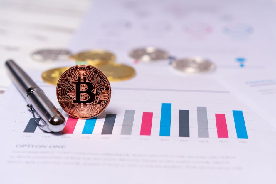
If you are new to cryptocurrency investing, learning how to read crypto market charts is one of the most important foundational skills you can develop. A **market-analysis** framework begins with understanding what a market chart actually represents: a visual history of price movement plotted against time. Every cryptocurrency trading platform displays charts as the primary interface for evaluating an asset’s performance, and being able to interpret those charts correctly gives you a significant advantage over investors who rely solely on social media tips or gut feelings.
Market charts plot two primary axes. The **horizontal axis** represents time — ranging from minutes to years depending on the time frame you select. The **vertical axis** represents price, typically denominated in US dollars for most American traders. Between those axes, the chart displays trading volume, price patterns, and a range of technical indicators that help analysts gauge momentum and potential direction.

Before diving deeper, you need to understand a few essential terms that appear repeatedly in any market-analysis discussion:
- **Time frame** refers to the duration each data point on the chart represents. Common time frames include 1-minute, 15-minute, 1-hour, 4-hour, daily, and weekly charts.
- **Trading volume** measures how much of a cryptocurrency changed hands during each period. High volume during a price move adds credibility to that move.
- **Moving averages (MA)** smooth out price data over a set period, making it easier to identify the overall direction of a trend.
- **Support and resistance levels** are price zones where buying or selling pressure historically concentrates, potentially slowing or reversing price movement.
Understanding these core components sets the stage for every other skill in reading cryptocurrency charts. Do not skip this foundation, because everything else builds on these concepts.
Types of Market Charts
Cryptocurrency charts come in three main formats, and each one serves a different purpose depending on what you are trying to analyze. Most beginners start with one type and gradually incorporate others as their skills develop.
**Line charts** are the simplest format. They connect a single price point — usually the closing price — for each time period with a continuous line. Line charts are exc nt for getting a quick sense of the overall direction of an asset over time. They strip away noise and make long-term trends easy to spot. However, they do not show you the high, low, or opening price for any given period, which means you lose important context about intraday volatility.
**Bar charts**, sometimes called **OHLC charts** (Open, High, Low, Close), display more information than line charts. Each bar represents four data points: the price at the open, the highest price reached, the lowest price reached, and the price at the close. The vertical line shows the full price range for that period, while horizontal ticks on the left and right indicate opening and closing prices. Bar charts are popular among traders who want to see volatility within each period without the visual complexity of candlestick charts.
**Candlestick charts** are the most widely used format among active cryptocurrency traders. Each candlestick represents the same four data points as a bar chart — open, high, low, and close — but presents them in a visual format that makes patterns and sentiment easier to recognize at a glance. Candlestick charts are the industry standard for technical analysis in crypto markets.
Comparison of Chart Types
| Feature | Line Chart | Bar Chart | Candlestick Chart |
|---|---|---|---|
| Shows open price | No | Yes | Yes |
| Shows close price | Yes | Yes | Yes |
| Shows high and low | No | Yes | Yes |
| Visual pattern recognition | Limited | Moderate | Exc nt |
| Best for beginners | Yes | Moderate | Yes (recommended) |
| Level of complexity | Low | Moderate | Moderate to high |
Reading a Line Chart
Line charts are often the first tool beginners encounter when they open a cryptocurrency exchange or a market data website. Their simplicity is their greatest strength for people who are just starting to learn how charts work. By connecting only the closing prices over time, a line chart creates a clean visual record of an asset’s general trajectory.
When you look at a line chart, your first task is to identify the direction of the trend. Are prices generally moving upward over time, downward, or moving sideways within a range? An **uptrend** appears as a series of higher highs and higher lows. A **downtrend** shows the opposite pattern — lower highs and lower lows. A **sideways market** means prices are oscillating within a defined horizontal range without establishing a clear directional bias.
**Support levels** on a line chart are areas where buying pressure has historically prevented the price from falling further. You can often spot these zones by looking for areas where the price has bounced multiple times after declining. **Resistance levels** are the opposite — price zones where selling pressure has historically prevented further gains. When the price approaches a support or resistance level, experienced traders watch closely because a break below support or above resistance can signal a significant shift in market sentiment.
Moving averages (MA) are frequently overlaid on line charts to smooth out short-term noise. The **50-day moving average** and **200-day moving average** are the most common periods used in cryptocurrency analysis. When the price is above its moving average, it is generally considered bullish. When it falls below, it is considered bearish. The point where a short-term moving average crosses above or below a long-term moving average is called a **golden cross** or **death cross** respectively — events that many traders monitor as potential trend change signals.
Interpreting Bar Charts
Bar charts give you substantially more information than line charts because they display the full price range for each period. If you are serious about learning market-analysis techniques, understanding how to read bar charts is essential because they are the bridge between simple line charts and the more complex candlestick format.
Each vertical bar on the chart represents one time period. The bottom of the bar shows the lowest price reached during that period, and the top shows the highest price. The small horizontal line on the left side of the bar is the opening price, and the line on the right side is the closing price. If the closing price is higher than the opening price, the bar is sometimes colored green or blue to indicate buying pressure. If the closing price is lower than the opening, it is often colored red to indicate selling pressure.
One of the most useful applications of bar charts is identifying **trading ranges** — periods when the price is moving within a defined high-low corridor. When a price breaks decisively above the upper boundary of a trading range on high volume, it often signals the beginning of a new uptrend. Conversely, a break below the lower boundary can signal the start of a downtrend. These **breakouts** and **breakdowns** are fundamental concepts in technical market-analysis.
Many traders supplement bar charts with momentum indicators. The **Relative Strength Index (RSI)** is one of the most widely used tools for measuring the speed and magnitude of price changes. RSI is calculated using a formula that compares average gains to average losses over a set period, typically 14 time intervals. RSI values range from 0 to 100. When RSI rises above 70, the asset is considered overbought — meaning it may have risen too far too quickly and could be due for a pullback. When RSI falls below 30, the asset is considered oversold — meaning it may have fallen too far and could be positioned for a bounce. Understanding RSI is a critical skill for any beginner studying market-analysis methodology.
Understanding Candlestick Charts
Candlestick charts are the preferred tool of most professional cryptocurrency traders, and for good reason. They pack more visual information into each element than any other chart type, making it faster to assess market sentiment and spot potential reversal patterns. Learning to read candlestick charts is arguably the most important skill a beginner can develop in crypto market-analysis.
Each candlestick consists of two main parts: the **body** and the **wicks** (also called shadows). The body represents the range between the opening and closing prices. A **bullish candle** — one where the close is higher than the open — is often displayed as a green or white candle. A **bearish candle** — one where the close is lower than the open — is typically displayed as red or black. The wicks extend above and below the body, showing the highest and lowest prices reached during that period.
The length and position of a candle’s wicks carry important meaning. A candle with a long upper wick and a small body suggests that buyers initially pushed the price higher but s rs overwhelmed them by the close of the period, leaving uncertainty about the next direction. A candle with a long lower wick and a small body suggests the opposite — s rs pushed the price down initially, but buyers stepped in and drove it back up before the close.
Experienced traders watch for specific **candlestick patterns** that historically precede certain market behaviors. Some of the most common patterns include:
- **Doji**: A candle with virtually no body, where open and close prices are nearly identical. This signals market indecision and often precedes a trend reversal.
- **Hammer**: A bullish reversal pattern with a small body at the top and a long lower wick, suggesting buyers are stepping in after a decline.
- **Shooting star**: A bearish reversal pattern with a small body at the bottom and a long upper wik, suggesting s rs are stepping in after an advance.
- **Engulfing patterns**: A two-candle pattern where a smaller candle is followed by a larger candle that completely “engulfs” the previous one, signaling a potential reversal in the current trend.
These patterns are tools for reading market sentiment, not guarantees of future price movement. They should always be used in conjunction with other indicators and risk management strategies.
Analyzing Trading Volume
Trading volume is one of the most overlooked yet powerful elements of market-analysis. Volume measures the total number of cryptocurrency units that changed hands during a given period. It acts as a confirmation tool — when a price move is accompanied by high trading volume, that move is considered more reliable because it reflects broad participation across the market.
When you see a cryptocurrency price rising on low volume, that should raise a red flag. A price increase without strong volume behind it suggests that only a small number of buyers are driving the move, and it may not be sustainable. Conversely, a price decline on high volume signals strong selling pressure and broad market conviction behind the downward movement.

**Volume-by-price analysis** is a technique that combines volume data with price levels to identify zones where the most trading activity has occurred. These zones, sometimes called **volume profiles**, often become areas of strong support or resistance in the future. When a price approaches a high-volume zone from below, it may face resistance and struggle to break through. When a price approaches the same zone from above, it may find support and bounce.
The relationship between price and volume also helps traders distinguish between healthy pullbacks and dangerous trend reversals. In a healthy uptrend, you typically see price rising on increasing volume and pulling back on decreasing volume. This pattern indicates that selling during the pullback is weak relative to the overall trend. When volume starts increasing during what should be a minor pullback, it suggests that something has changed and the trend may be reversing.
Identifying Trends and Patterns
Recognizing market trends is the heart of effective market-analysis. All the chart types, indicators, and patterns discussed so far exist to help you identify and capitalize on trends. Without a clear understanding of trend direction, every other analytical tool loses much of its value.
An **uptrend** is defined by a series of higher swing highs and higher swing lows. In an uptrend, each pullback stops at a higher level than the previous one, and each advance surpasses the previous peak. As long as this structure holds, the path of least resistance remains to the upside. When the price fails to make a new high, or when a pullback dips below the previous swing low, the uptrend is considered potentially exhausted.
A **downtrend** is the mirror image — a series of lower swing highs and lower swing lows. Each rally fails to reach the previous high, and each decline surpasses the previous low. Downtrends can persist for weeks, months, or even longer in cryptocurrency markets, which are known for their extended volatility cycles.
A **sideways market**, also called a range-bound market, occurs when price oscillates between a clearly defined upper boundary and lower boundary without establishing a directional bias. Sideways markets are important to recognize because they often precede significant breakouts in either direction.
Beyond simple trend direction, traders use geometric **chart patterns** to anticipate future price behavior. Some of the most frequently cited patterns include:
- **Triangles**: Ascending, descending, and symmetrical triangles form when price converges into an increasingly narrow range, often signaling an imminent breakout.
- **Rectangles**: Horizontal ranges where price bounces between parallel support and resistance lines, often resolving in the direction of the preceding trend.
- **Head and shoulders**: A reversal pattern with three peaks, where the middle peak is the highest. This pattern historically signals a shift from bullish to bearish momentum.
- **Double tops and double bottoms**: Two failed attempts to break through a resistance or support level, often preceding a reversal in the opposite direction.
Understanding these patterns requires practice. Study historical charts of Bitcoin, Ethereum, and other major cryptocurrencies to see how these patterns have developed and resolved in real market conditions.
Risk Management and Investment Strategies
Understanding how to read crypto market charts is only half the battle. Without a disciplined approach to **risk management**, even the most accurate chart analysis will not protect your capital from the inherent volatility of cryptocurrency markets. Crypto assets can swing 10%, 20%, or more in a single day — far beyond the typical daily movement in traditional stock or bond markets. This volatility cuts both ways, which means losses can accumulate just as quickly as gains.
The most fundamental risk management principle is **position sizing** — never commit so much capital to a single trade or asset that a significant adverse move would severely damage your portfolio. Many experienced traders recommend limiting any single cryptocurrency position to no more than 5% to 10% of your total portfolio. This way, even if one asset drops significantly, your overall portfolio has a buffer.
**Stop-loss orders** are one of the most important tools for managing downside risk. A stop-loss is an automatic order to sell a position if the price falls below a predetermined level. By setting a stop-loss based on a support level you identified through your chart analysis, you can define your maximum potential loss on a trade before you enter it. This is what professional market-analysis is really about — not predicting the future, but managing risk within a range of probable outcomes.
**Diversification** across multiple cryptocurrencies and asset classes helps smooth out volatility over time. A portfolio that holds only one or two digital assets is far more exposed to idiosyncratic risk — the risk that something specific to one project causes a sharp decline. Spreading exposure across different sectors of the crypto market, as well as traditional assets, reduces the impact of any single adverse event.
No chart pattern, indicator, or analysis method can guarantee a profit. The cryptocurrency market operates 24 hours a day and is influenced by global regulatory news, macroeconomic conditions, technological developments, and social media sentiment in ways that can overwhelm even the most sophisticated technical analysis. Treat every chart signal as one input among many in your decision-making process, and never invest more than you can afford to lose entirely.
**Important Risk Disclaimer**: Cryptocurrency markets are highly volatile and speculative. All content in this article is for educational purposes only and does not constitute financial or investment advice. Prices of digital assets can fluctuate dramatically, and you may lose your entire investment. Always conduct your own research and consult with a licensed financial advisor before making any investment decisions.
Frequently Asked Questions (FAQ)
What are the most common mistakes beginners make when reading market charts?
Beginners often confuse short-term price noise with meaningful trends. A single red day on a candlestick chart does not mean an uptrend has ended, just as one green candle does not guarantee a new bull run. Newcomers also tend to overcomplicate their analysis by stacking too many indicators at once, which produces conflicting signals and analysis paralysis. Finally, many beginners ignore trading volume entirely, missing one of the most powerful confirmation tools available. Focusing on clarity — starting with clean price action on a single time frame — prevents these common pitfalls.
How can I improve my skills in analyzing and interpreting market charts?
The best way to improve is through deliberate practice on historical charts before risking real capital. Most cryptocurrency exchanges offer free charting tools with years of historical data. Pick a single asset, load it on a daily candlestick chart, and practice identifying support and resistance levels, drawing trend lines, and spotting the chart patterns discussed in this article. Over time, this practice builds pattern recognition skills that become intuitive. Many traders also keep a trading journal to record their observations and review past decisions, which accelerates the learning curve significantly.
What are some advanced techniques for reading crypto market charts that beginners should be aware of?
Once you are comfortable with the basics, you can explore **multi-timeframe analysis** — analyzing the same asset on daily, 4-hour, and 1-hour charts simultaneously to confirm that shorter-term signals align with the broader trend. **Moving Average Convergence Divergence (MACD)** is another step up from RSI, combining moving averages to identify both trend direction and momentum strength in a single visual indicator. **Ichimoku clouds** offer a comprehensive system that plots support, resistance, trend direction, and momentum on a single chart. These tools require more study but provide richer market-analysis insights as your skills develop. Always remember that advanced techniques work best when they confirm signals from basic price action analysis rather than contradict them.
How do I choose which chart type is best for my trading strategy?
The right chart type depends on your goals and experience level. Line charts are best for long-term investors who want a clean view of overall trend direction without distraction from daily noise. Bar charts are a good middle ground for traders who want OHLC data without visual complexity. Candlestick charts are the most versatile and are recommended for anyone planning to do active technical analysis, because the visual format makes pattern recognition significantly faster and more intuitive.
Explore more market analysis guides on our site.
Charting & Exchange Resources
| Platform | Use Case | Key Feature | Fee Model | Action |
|---|---|---|---|---|
| TradingView | Charting & technical analysis | Indicators, multi-timeframe charts | Free / Pro tiers | View Platform |
| Coinbase | Exchange (beginner-friendly) | Simple USD on-ramp, educational tools | Varies by region | View Platform |
| Binance | Exchange (advanced pairs) | Wide altcoin coverage, spot markets | Varies by region | View Platform |
Affiliate Disclosure: This post contains affiliate links. We may earn a commission if you buy through our links, at no extra cost to you. Investment Risk Disclaimer: Cryptocurrency and digital asset markets are highly volatile. This content is for informational and educational purposes only and is not financial, investment, or trading advice. You may lose some or all of your capital. Do your own research and consult a licensed financial advisor before making investment decisions.